The Design of the 2026 World Cup, Reviewed
A late (but comprehensive) design review of the 2026 FIFA World Cup.

With the transfer market closed and the regular season of club football well underway, the 2026 World Cup still lingers in the corners of our eyes. With said eyes turning towards speculation about the new season, Gianni Infantino’s (seemingly) inevitable exit, and everything else that our attention commands, I wanted to take a clear-eyed look back at the barrage of designed objects the World Cup produced. From jerseys to hyped-collabs to bootlegs to memes, this tournament was bursting with visual fodder.
An Identity Without One | The 2026 World Cup Identity Reviewed
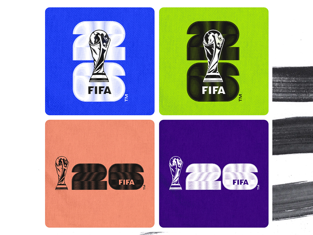
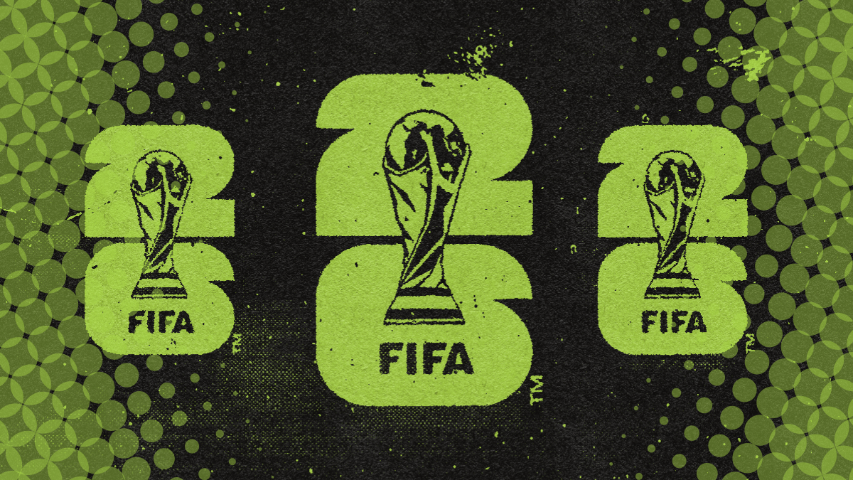
What is lost when a World Cup has to represent with multiple national identities? Seemingly, the ability to do anything interesting. Historically, it’s been a joy to see how each nation has displayed its identity through design of their World Cup, but something has been lost in anchoring a brand to “Unprecedented unity.” It is all competent, recognizable but not distracting, easily translatable, and everything else that a global brand design must be in 2026. But it’s missing anything that might be remembered in another 4 years, largely due to this necessity to include everyone. The only thing that caught our eye in reading the 184 page brand guidelines were the special applications, which are explicitly not for use on screen. What a missed opportunity to pine about ‘weaving together the threads of the North American continent’ or some other branding bullshit. Great things happen when you are forced into restrictions, and these mockups which almost nobody will see speak to that.
The Best of Everything Else
Best Kits | Norway Away
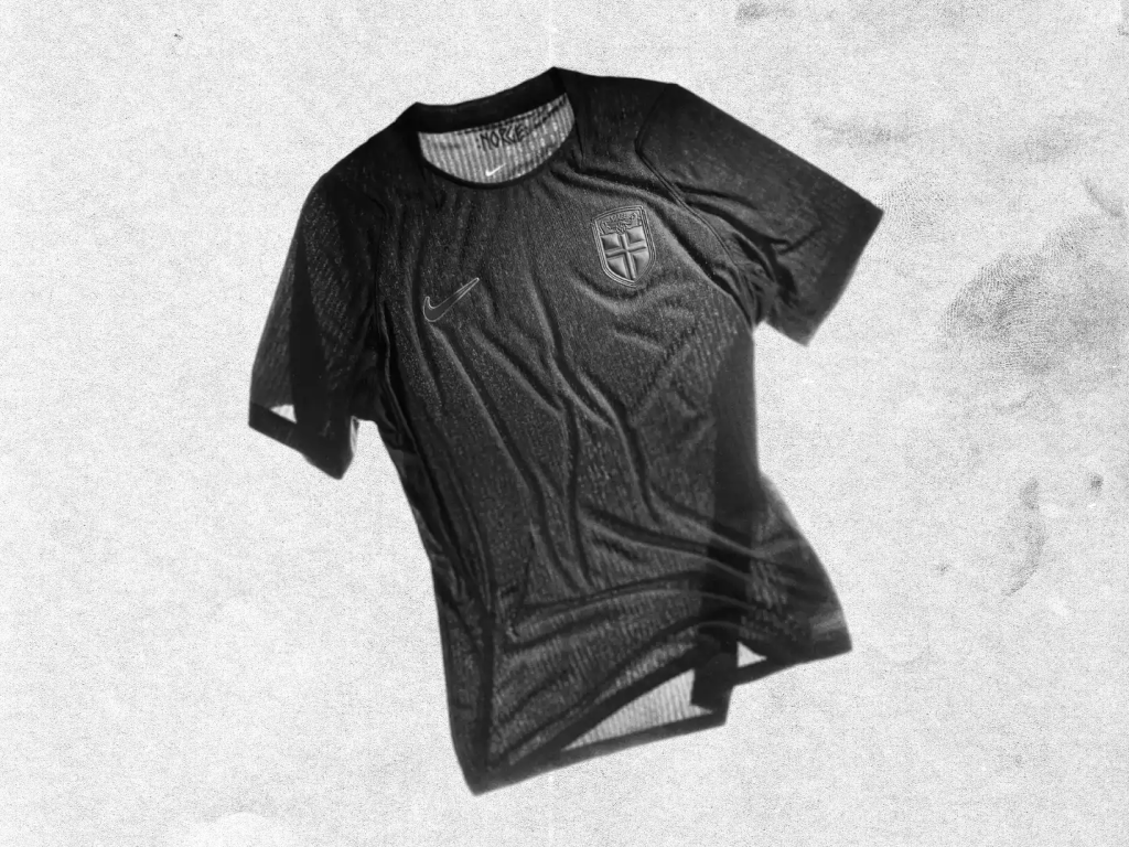
Despite the general trend of football jerseys all being cut from the same template and produced by the same 4 corporations, the increase in teams introduced us to a variety of new colorways, silhouettes, and manufacturers. That being said, Nike, the American sportswear giant, understood that this was their moment to seize, and delivered on a variety of strong designs. Our favorite was Norway's murdered out away kit, an exercise in restraint that still retained personality. The typeface, the patterned detailing, and even the rendering of the fabric felt unique to the nation and would also look great on the street.
Honorable Mention: DRC Third Kit
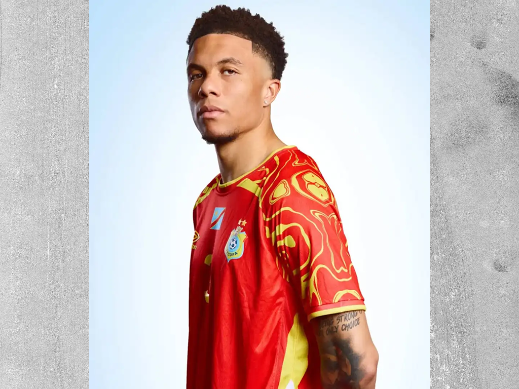
It’s always nice to Umbro on the pitch, and their kit for DRC utilized pattern well when other nations seemed to be wary of them.
Best Official Collab | Willy Chavarria x Adidas
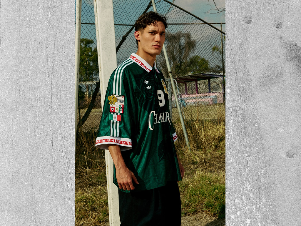
Despite Nike going big in the collab department teaming up with a who’s who of international fashion brands, we have to give the nod to Adidas for their (ongoing) collaboration with Mexican designer, Willy Chavarria. Every piece in the collection is a hit, from the oversized and adorned jersey to the flipped Mega Low to the fantastically elongated shorts, not a single piece felt underbaked. I have to imagine that Chavarria’s ongoing relationship with Adidas allowed for deeper design considerations, which put the collection above Nike’s all-out blitz approach.
Honorable mention: France x Nike x Jacquemus
I couldn’t not mention that goalkeeper jersey with its chunky collar and perfect pin-stripes.

Best Pre-Match Fits | DR Congo

DRC arrived with sharp tailoring courtesy of Paris based designer Alvin Junior Mak. Drawing from La Sape and the history of the Congolese football, the Dark Moniama suit has stuck in my mind. Leopard print could have easily been deployed cynically, a classic stereotype of the ‘African,’ but Mak used it expertly, deploying contemporary manufacturing techniques to modernize the print. The patchwork on the bag is particularly impressive.
Honorable Mention: Côte d’Ivoire’s tie-dyed orange jackets
I will never not enjoy some well-crafted tie-dye.
Best Social Media Presence | Michael Olise + Lukas Korschan
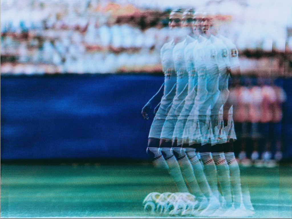
Michael Olise leaned into his reputation as the enigmatic auteur, displaying exactly what you can do with great taste and without corporate sponsors. Exclusively featuring the distorted images of German photographer, Lukas Korschan this World Cup, Olise took an artful approach to what could’ve otherwise been rote. The images lean into our collective analog obsession, utilizing an old CRT-TV that Korschan watched the 1998 World Cup on (the project was in Korschan’s own words, an homage to Harry Gruyaert). I’d love to see more athletes commission works like this, taking a risk to capture a vibe rather then sell us their latest endorsement.
Best Local Branding | New York City
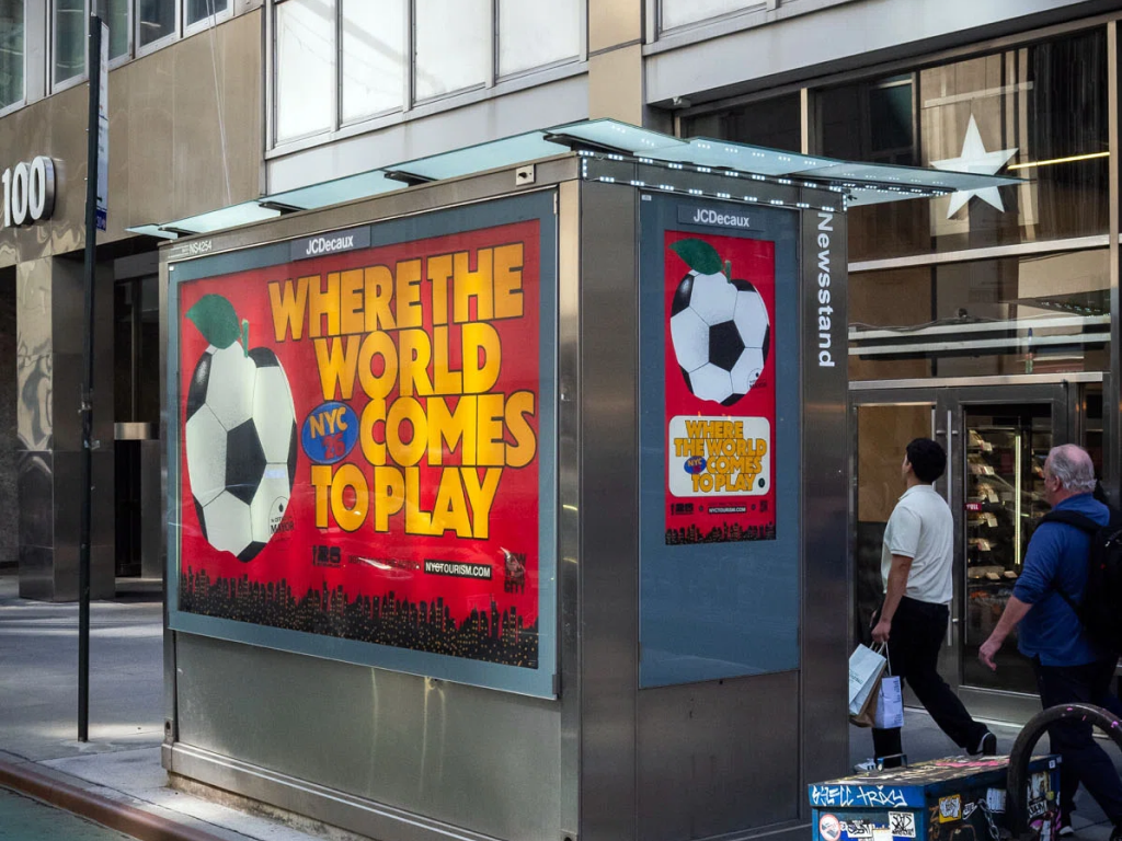
I mean, what else could we possibly have put here? NYC wins again, with our football fanatic mayor commissioning a full visual identity for the host city. The standout design of the campaign is the apple/soccer ball hybrid, so perfectly rendered with the noise and grit of New York, with a healthy amount of cheeky whimsy to ongoing design language being built by City Hall. Shoutout to Arsh Raziuddin for the tremendous work on this.
The viral jerseys saw a mixed response in our office though. We loved the idea of them: locally made, locally designed, a kit for those who aren’t interested in swearing allegiance to any nation besides Mamdanistan. In execution though, the design itself left much to be desired. The color-ways weren’t quite right, the type felt a bit off, and they generally didn’t feel like they justified the extreme levels of hype they generated. That soccer/apple felt like it could’ve been the primary element with the type supporting on the back of the kit, in a more traditional sponsor/player relationship. That being said, we all agreed that if you got your hands on one, it’s an iconic piece of NYC design history regardless and is something for the archives.
Best Unaffiliated Merch Drop | Design FC (Senegal Kit)
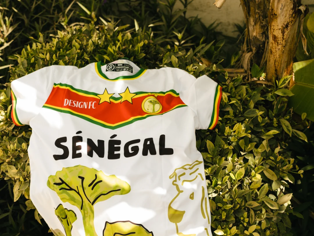
Bootleggers, screenprinters, nightclubs, and everyone in between seemed to have cashed in on World Cup fever, but our favorite object from someone who wasn’t officially affiliated with the tournament came from DesignFC. The youth-focused organization commissioned young designers from across the world to create custom kits to represent their country, and there were some true standouts amongst the bunch (the Palestine and Scotland jerseys in particular). Our favorite came from Senegal, designed by 14 year old Marie Pierre. Of anything on this list, go read up on the full collection.
The Worst of the Worst (What, you thought we only had nice things to say?)
Worst Kit | Canada Away
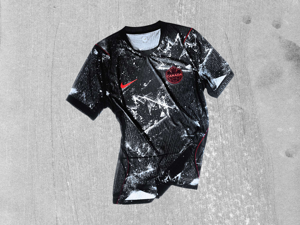
It just looks gross, and not in a sick way. It looks interesting flat, but on broadcast, these looked horrendous.
Worst Ads | Polymarket x Rick Rubin

Kalshi tried their hardest to have the worst sports betting ads of the tournament, but the Polymarket couldn’t be stopped. Rick Rubin has been on notice for some time (if you’ve been paying attention), but what a way to announce that you are in-fact, devoid of integrity and willing to leverage your status as a ‘creative genius’ to sell betting to teenagers on the world’s stage.
Honorable Mention | Claude
I heard one of these ads while I was away from my computer and got physically angry.
Funniest Corporate Fuck-Up | You get pink boots, you get pink boots, you all get PINK BOOTS!
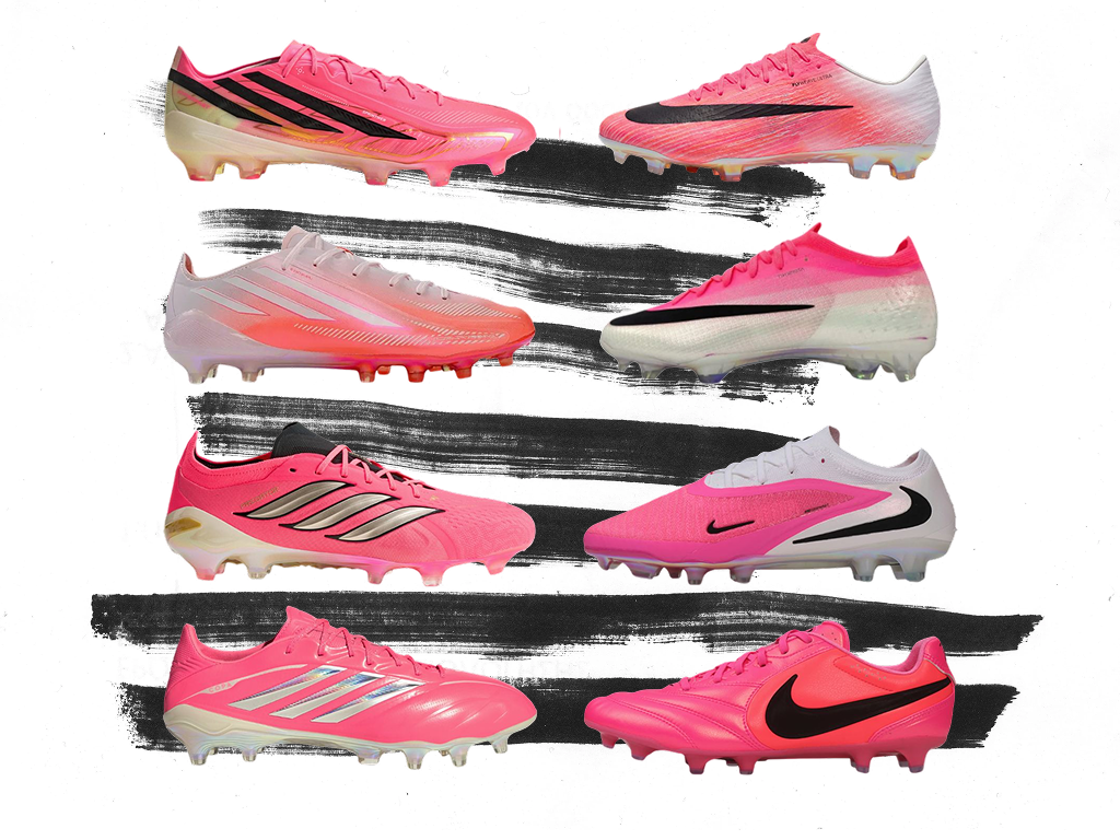
Why did everyone having pink books warrant a formal apology from Adidas? How did literally every brand not have a single original idea in this domain? How many other colors were veto’d by committee? When will we be freed of the shackles of corporate colorways?
Until 2030
So, how did the World Cup do in the design department overall? As usual, its more complicated than a simple binary. The real winners of the design Golden Boot are those who chose to stand apart, through sanctioned collaborations and anti-Imperialist bootlegs alike. I look forward to seeing what lessons we take with us to Spain, Portugal, and Morocco.