
The Most Notable Album Covers of July, from Jim Legxacy to Clipse: Cover Stories
Welcome to Cover Stories, a monthly column celebrating and shading anything and everything related to design and music.

The Most Cynical Visuals of the Month: KAWS for Clipse
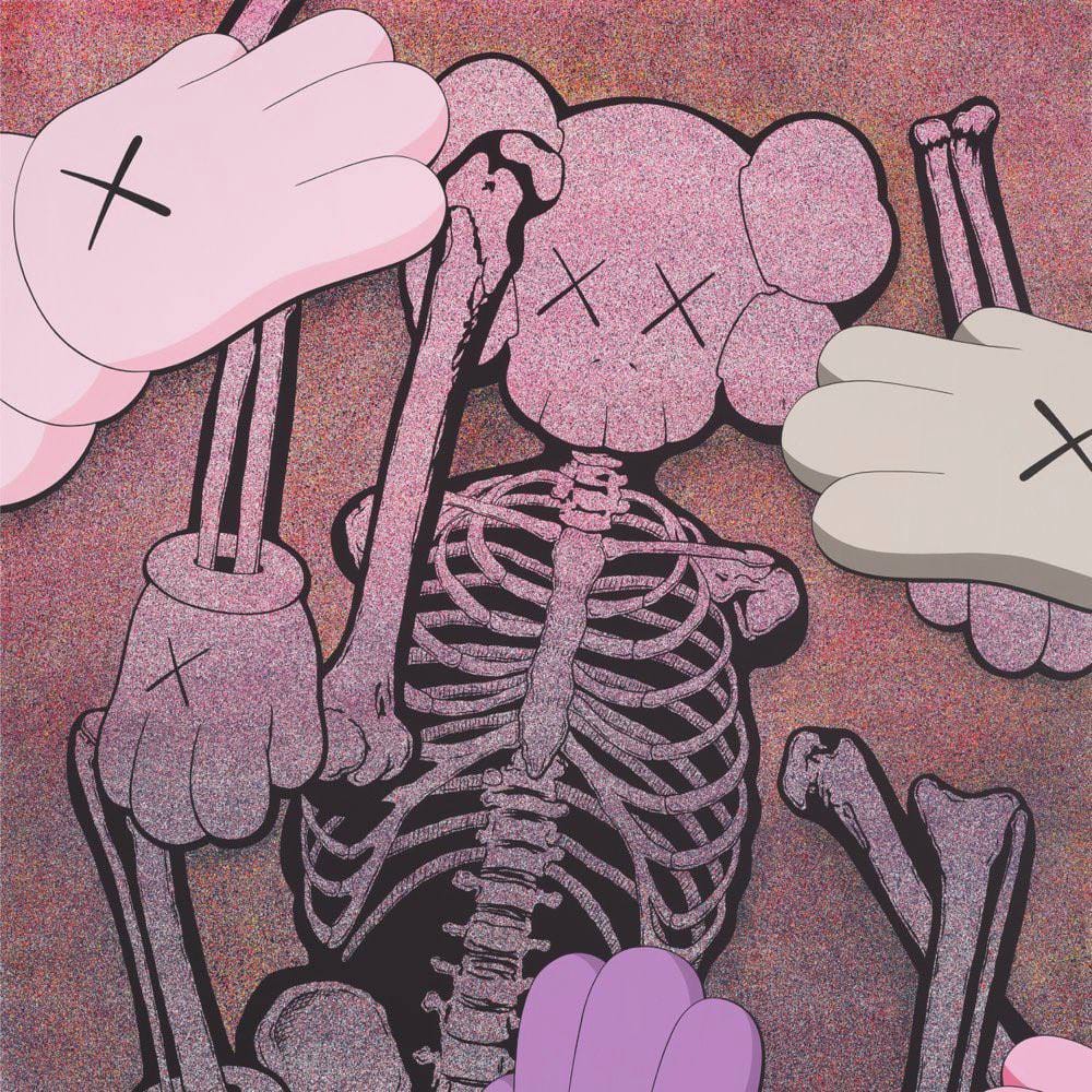
Let’s start with Let God Sort Em Out, which has had a much discussed ‘traditional’ rollout and has certainly prospered from it, achieving critical and cultural success (I’ve been hearing it blaring from cars in Brooklyn for weeks). But we’re not here to talk about the beefs or the Tiny Desk or Malice’s contempt for the media, we’re here to talk about how the Millenial Jeff Koons himself, KAWS, continues to wedge himself into the cultural conversation all the way into 2025.
On the whole, the visuals surrounding Let God Sort Em Out have been excellent in conjuring a gritty opulence, from the black and white ballerinas in the ‘So Be It’ video, to the variety of trendy collabs available to purchase, to my personal favorite item of the rollout, the phenomenal cover by artist Josh Sperling (more on that later), but the KAWS cover brings up bad memories (Til the Casket Drops does not hold up, visually or sonically), and feels like a cheap nostalgia play when the record has proved that this reunion is more than just that.
The KAWS cover feels cynical, designed to elicit a market response more than an emotional one. Josh Sperling’s special edition cover feels far more evocative of the record itself, playing upon Pusha T and Malice’s established dichotomy in tone, and weaves in the religious undertones in a way that is subtle and serious. KAWS on the other hand, reminds us that at a certain level, hip hop is a marketing product, and in 2025 you better be moving vinyl, merch, and anything else you can in order to hit those financial targets. While the refrain, “THIS IS CULTURALLY INAPPROPRIATE,” rings over and over on the record, the KAWS cover feels painfully appropriate.
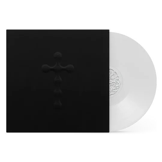
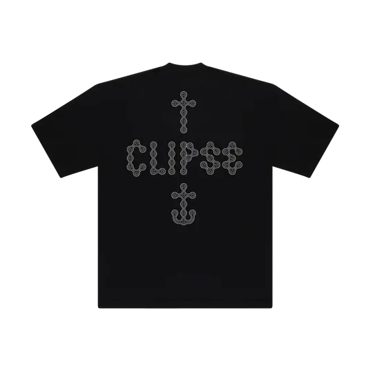
Josh Sperling's designs for the special edition of Let God Sort Em Out
The Cross and the Anchor. The Cross to represent sin, death and faith. The Anchor to represent strength and stability in unknown waters. Two symbols for two brothers. – Josh Sperling
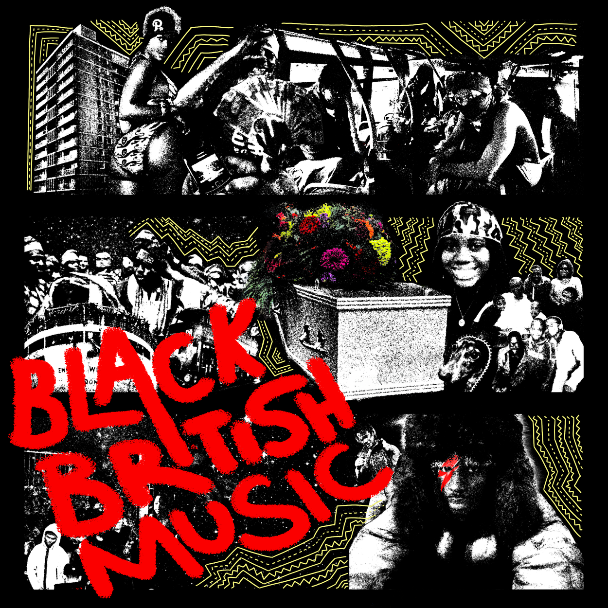
The Best Visuals of the Month: Everything from Black British Music (2025) by Jim Legxacy (Designed by gumskool)
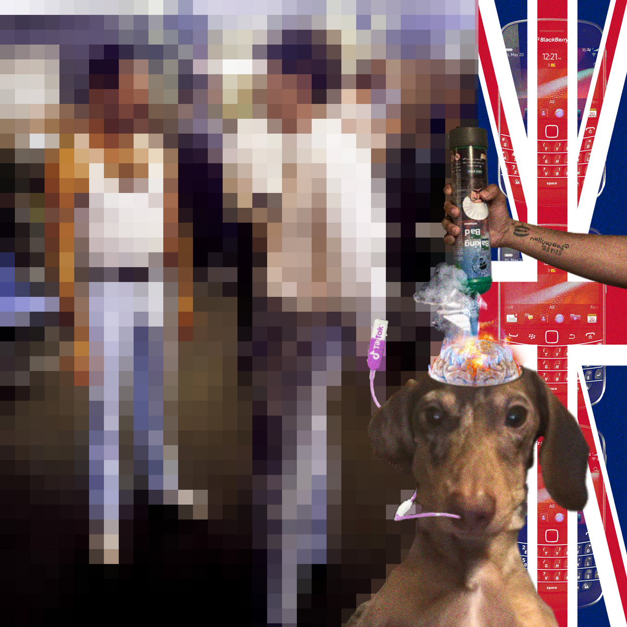
Covers for 'Stick' and 'Black British Music (2025)
Nostalgia is a key theme in this month's column, and Jim Legxacy’s Black British Music (2025) embraces that nostalgia in a far less cynical way than Clipse. While the KAWS cover feels like weaponized nostalgia to move merch, everything about the design of Black British Music (2025) feels genuinely playful and reverent. In the realm of cover art, ‘Stick,’ designed by gumskool, is my personal highlight. The layering of the Blackberry, the squished flag, the comedic collage elements, and the perfectly pixelated image (likely for legal reasons as the original image features David Bowie and Freddy Mercury), come together to build a striking composition that is a near 1-to-1 distillation of the track. And while I do enjoy the cover for the album (also designed by gumskool), ‘Stick’ takes the cake. gumskool seems to have cornered the market on throwback-heavy visual design for a certain crowd of English artists, having worked with PinkPantheress, Len, fimiguerrero, yt, and more. He has talent for designing things that truly feel like they jumped right out of the eras he’s referencing, and displays a deeply reverence for the subject matter without falling into parody.
Video titles for yt and Jim Legxacy by gumskool
That’s not all that Black British Music (2025) has to offer in terms of visuals though, as the videos have been standouts in their own right.
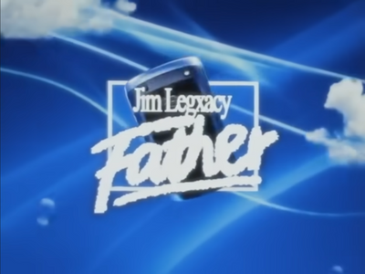
The video for ‘father’ in particular (directed by LAUZZA who has also been perfecting a nostalgia-drenched style, most recently for PinkPantheress) is perfection when it comes to capturing a place and a time through the glowing lens of nostalgia. Releasing the video in 480p is inspired (if not wholly unique, as artists like Che, which we’ll see later, have been turning the fidelity down as well), and immediately transports you back to the early 2000s. This is further exploded in the the collage sections, which are mesmerizing in their density and movement, and expertly reflect the character of Jim Legxacy’s music: kaledescopic, deeply British, and bursting with unexpected connections.
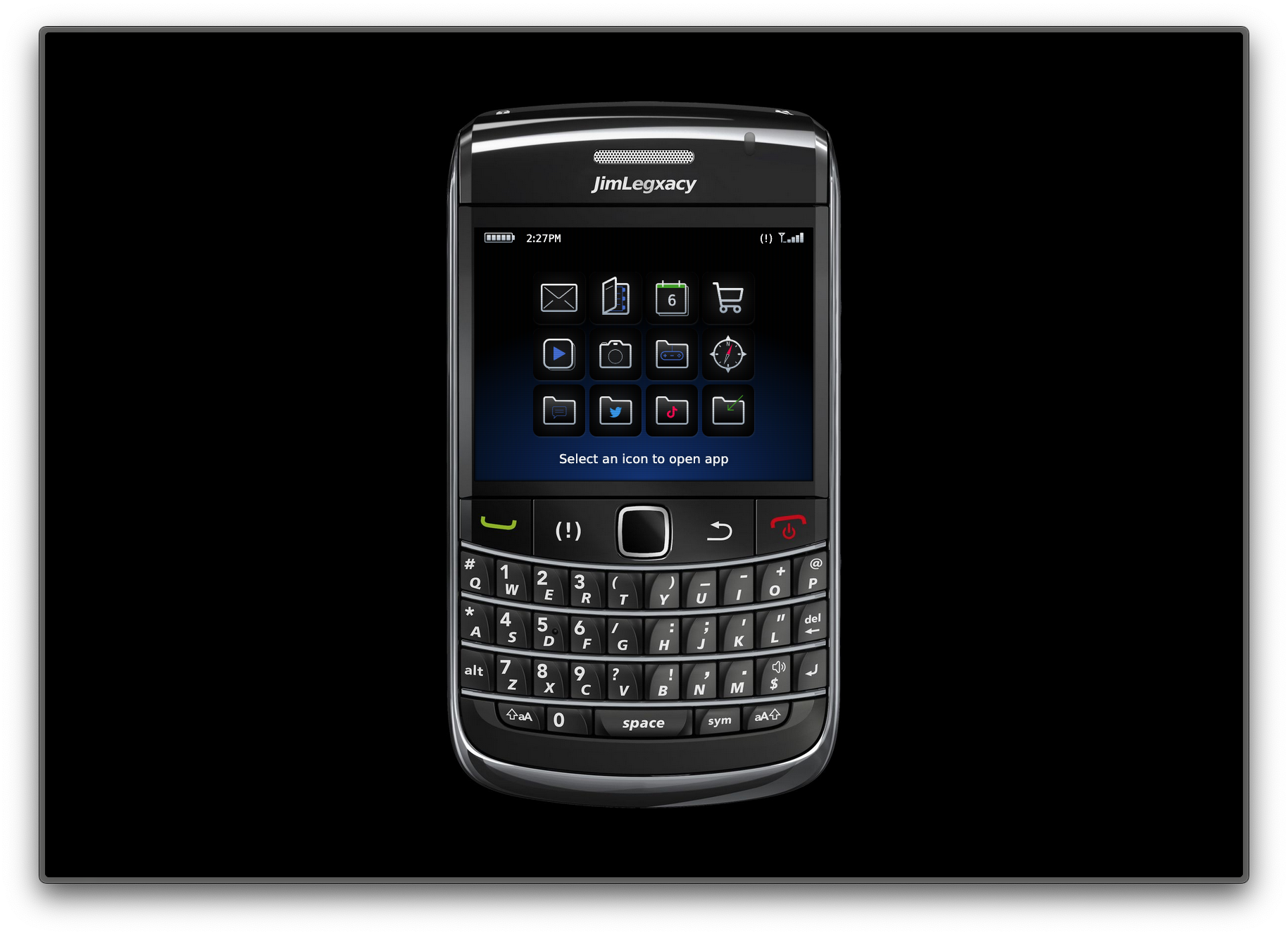
Don’t sleep on the BBM website either, which condenses everything you might need to know into a Blackberry screen, complete with brick breaker and old photos.
Other Notable Covers, Videos, and More...
With the heavy hitters out of the way, let's look at some other designs of note from July.
REST IN BASS by Che (Designed by thenucleargladiator)

REST IN BASS conjures up its own cocktail of nostalgia, mixing peak Soundcloud-era aesthetics like metal revival and even a healthy dose of 2010s Givenchy and Hood By Air, to create a compelling, if not predictable outcome. Sonically, REST IN BASS sounds blisteringly contemporary–anxiety inducing synths, bass pushed far into the red, verses drenched in repetition and auto-tune. The cover art does capture the ‘rockstar lifestyle’ that Che indulges in, but it feels strangely safe in contrast to the music. It is properly opulent and adequately sleazy (the speakers-as-skull is an inspired choice), but it fails to capture the feeling of bass booming in your chest. Maybe I just have too great a fondness for some crunchy textures, but this one felt like they could’ve turned the dial up to 15 to match the energy of the music.
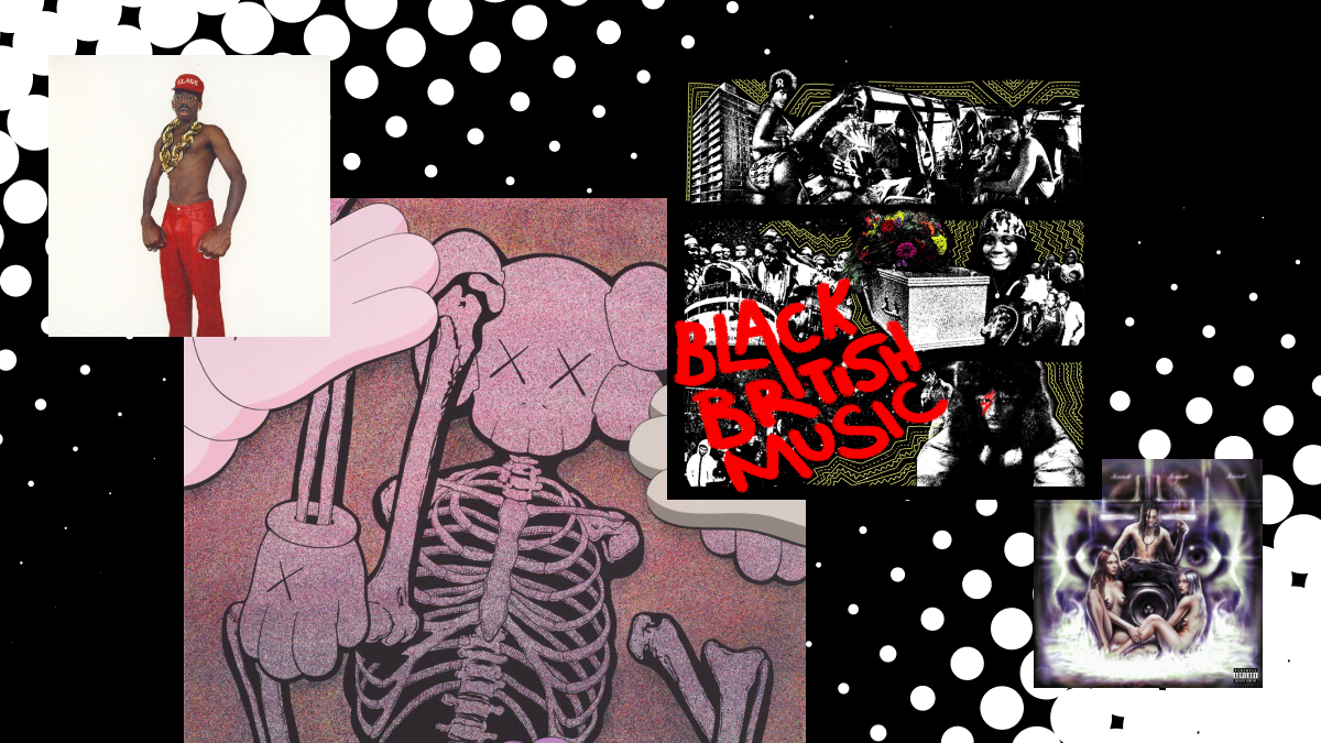
DON'T TAP THE GLASS by Tyler, the Creator (Designed by Tyler, the Creator)
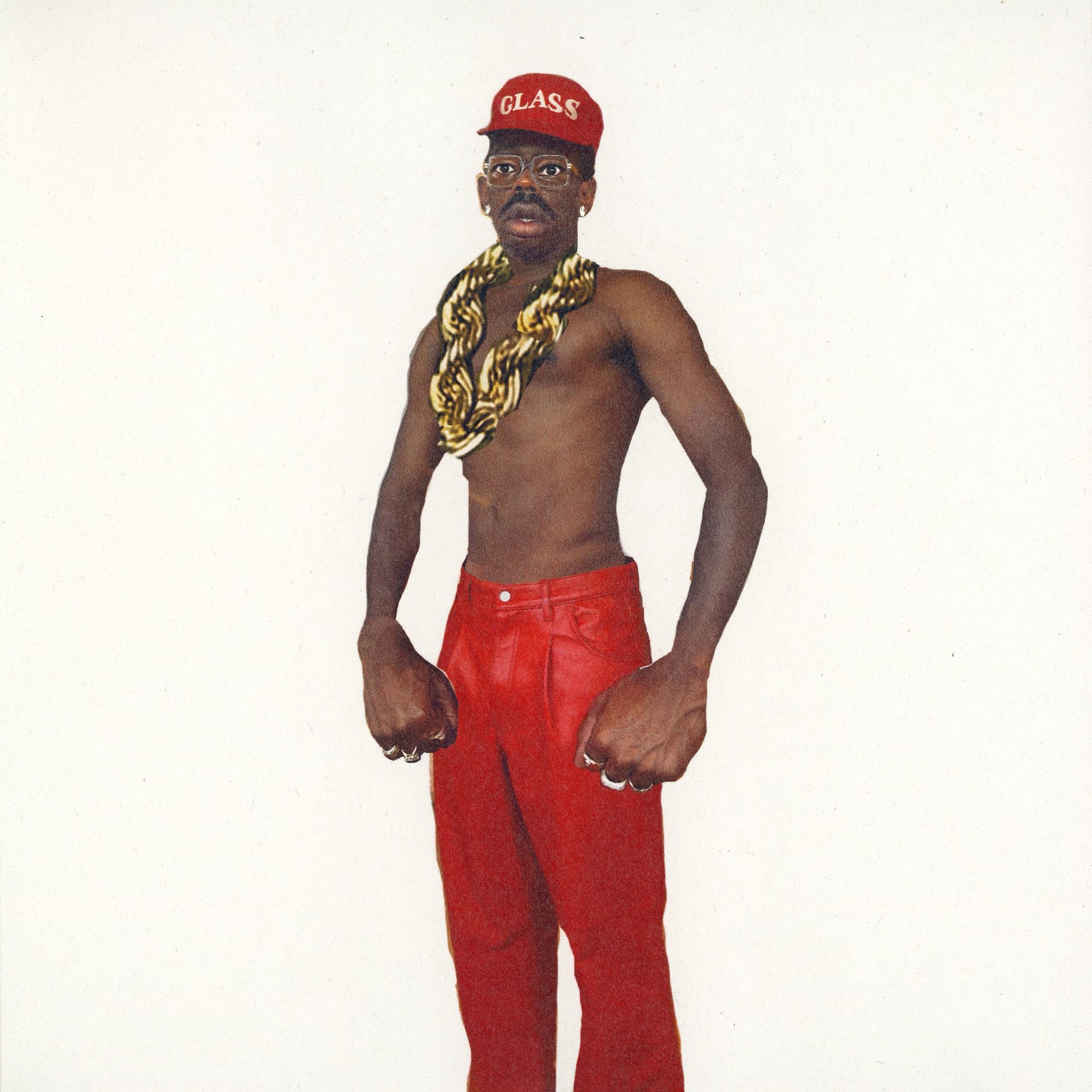
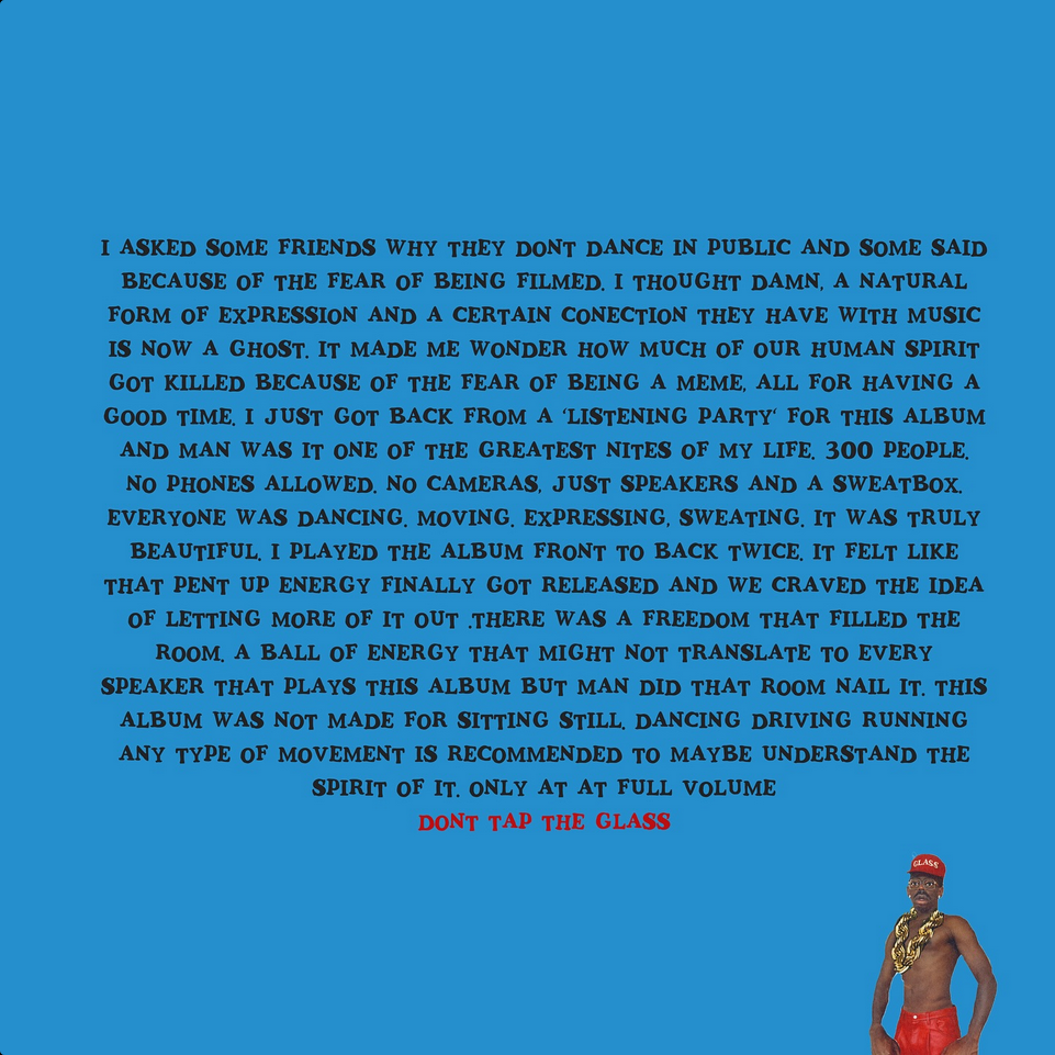
Tyler, the Creator himself wrote that ‘THIS ALBUM IS NOT FOR SITTING STILL,’ and his distorted, messily Photoshopped, shirtless portrait does well to capture that movement: chain mid-swing, shoulders squared up and ready to move at the drop of the next beat. The type treatment similarly communicates that movement, with dancing slab serifs that feel like they were ripped from a DIY flyer for a living room dance party. Tyler even squeezes in a handful of nostalgic references here, nodding to classic, macho (and silly) rappers, like 50 Cent, Ludacris, and LL Cool J. A simple but highly effective piece of cover art.
'Cocoa Body' by Halima (directed by Bellamy Brewster)
Lastly, ‘Cocoa Body’ has been stuck on repeat lately, in no small part thanks to the video shot by Bellamy Brewster (who has been honing his ability to capture sex appeal, having worked with Usher on the cover for Coming Home). The sexy, sweaty, and stylish video wouldn’t feel out of place on BET in 2001, and portrays exactly the ideal setting to hear ‘Cocoa Body’ in. Videos like this create nostalgia for a moment that hasn’t happened yet: wining and pining at the club in the summer heat, staring down a pretty face, embraced by the music. While I haven’t gotten the chance to hear it out (minus an intimate performance with Bathe a few weeks back), whenever I do, the visuals from the video will be on my mind. Now that’s the sign of a video well directed.
Let me know what caught your eye this month in the world of music in design in the comments, and with that, I’ll catch you next month.